Picking apart my listening history
Doing sick things with my data

Setting the tempo
I’ve been thinking a lot about how I can mess around with data to scratch an itch I’ve been feeling over the past few months. There have been two concrete things I’ve been wanting to do:
-
Play with a large, real dataset again.
-
Find meaningful conclusions and put them on display.
Yes, we do get to do this in university, but that’s a pretty closed environment typically with synthetic data. I had an incredible amount of fun during my internship when I got to handle a huge dataset with real data, riddled with problems waiting to be solved. I very much understand how insane that sounds, and I can already hear data analysts groan at the sound of that, but I genuinely find it satisfying when I trudge through the data cleaning step, and create some meaningful insights. Honestly, I miss it.
Recently, I found out that you can simply request your extended listening data from Spotify with a few clicks and a consent signature. Since I’ve been reasonably faithful to listening to my music on Spotify, I have accumulated a huge dataset that provides countless opportunities for analysis.
Let’s pick apart my Spotify listening history.

Let’s answer some questions
How much data are we talking about?
My listening history spans from September 2017 all the way to January 2025. Over these years, I dabbled in other streaming services from time to time, but I quickly kept crawling back to Spotify, so the holes in the data shouldn’t be too large. There should be roughly 95,000 audio sessions, each recording when I hit play, how long I listened, and metadata such as track and artist.
Why Spotify?
I keep coming back to this platform because of its insane recommendation algorithm. Since I have been using it for so long, Spotify has a dense dataset to learn my listening patterns to suggest my next favourite song.
Why am I doing this?
Spotify, like many social platforms, collects an incredible amount of data from its users to make recommendations. Though it might seem like magic, it isn’t. I’ve discovered so many of my favourite artists, all because of this incredibly robust algorithm, which sparked a bit of curiosity in my mind- I want to know what I can learn from my Spotify extended listening history.
What am I going to do with the data?
Let’s process the data, create some graphs, and draw some insights. I’m going to have to clean the data and explore the history. I’ve attempted to create a time-series forecast of my listening habits, alongside other very colourful charts.
That sounds difficult. Why would you do this to yourself?
Like I mentioned earlier, I like it. As masochistic as that may sound, I’m sometimes drawn to complex problems. Honestly, after working with many different messy datasets, my Spotify dataset is pretty clean, all things considered. The problem solving comes in during data translation, so I can process it easily; and then figuring out how to creatively display the data I want to analyze in the best way possible.
All of my code will be in Python, using familiar libraries like pandas, matplotlib, and pmdarima.
Data Prep
The extended streaming history I requested from Spotify comes as large JSON files. Each record contains a UTC timestamp, milliseconds listened, and details about the song. I combined all of my data files into a single data frame, converted the timestamps to my local time zone (Eastern Time; America/New_York), and computed a few helpful columns such as hours played, day of the week, and hour of day.
Here’s some Python code to paint an idea of what we are looking at:
Click here to reveal the code snippet
import os, json
import pandas as pd

# Load all audio history JSON files
base_dir = '/path/to/Spotify Extended Streaming History'
records = []
for fname in os.listdir(base_dir):
    if fname.startswith('Streaming_History_Audio') and fname.endswith('.json'):
        with open(os.path.join(base_dir, fname), 'r', encoding='utf-8') as f:
            records.extend(json.load(f))

df = pd.DataFrame(records)

# Convert the UTC timestamp to local time
df['timestamp'] = pd.to_datetime(df['ts'], utc=True).dt.tz_convert('America/New_York')
df['date'] = df['timestamp'].dt.date

# Convert milliseconds to hours for easier interpretation
df['hours_played'] = pd.to_numeric(df['ms_played'], errors='coerce').fillna(0) / (1000 * 60 * 60)The earliest play in the dataset is September 4, 2017, and the latest play is January 12, 2025. There were some days where I hardly listened to anything at all, and on others, it looked like I just kept a playlist running for hours.
Let’s dig in a little further.
Listening over time
First, I aggregated the data by day to see how many hours I listened on each date. The result, plotted below, covers the entire seven-plus years of history. Peaks correspond to marathon listening sessions, whereas the troughs are days when I hardly used Spotify.
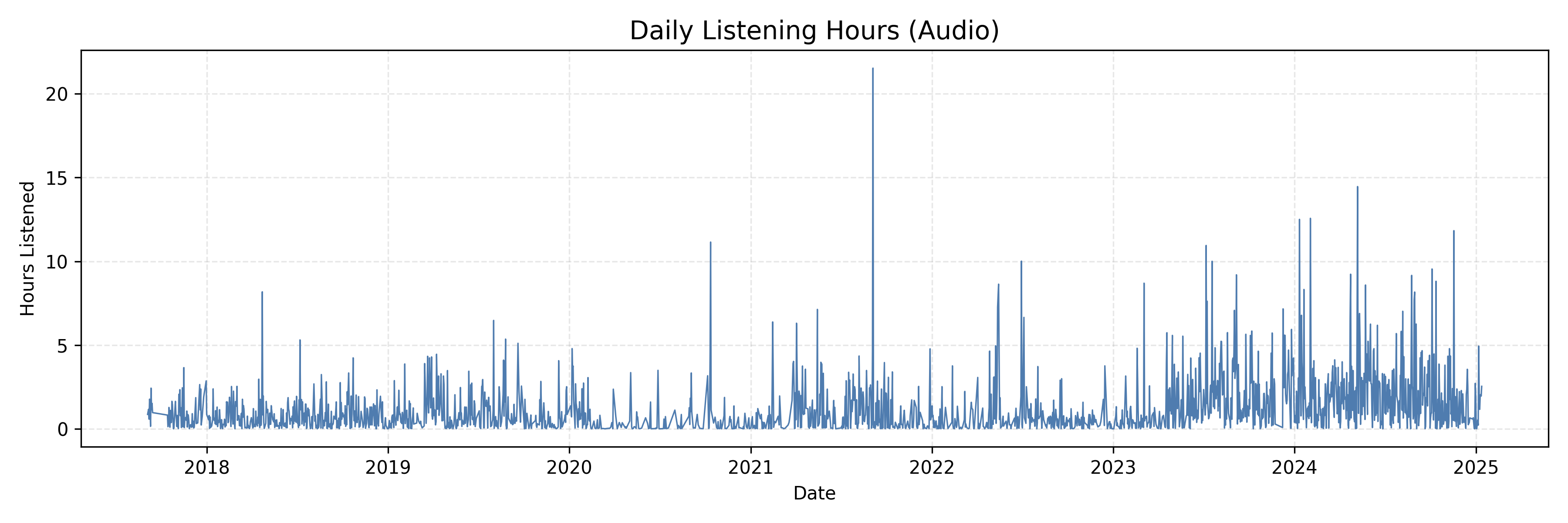
What’s fun is that I can relate those peaks to road trips and times of prolonged study sessions. I also see a general upward trend. My listening time started climbing in early 2023 and stayed high through 2024. More often, I found myself having music on in the background as I got older.
When am I listening to music?
Something I don’t really see during the yearly Spotify Wrapped is how much I listen to music during each hour of the day. Time of day and day of the week can reveal behavioural patterns. I grouped each listening event by each day and hour, summed the hours listened, and then divided by the number of occurrences of each day to compute an average listening heatmap. Darker shades mean I listened more on average at that time.
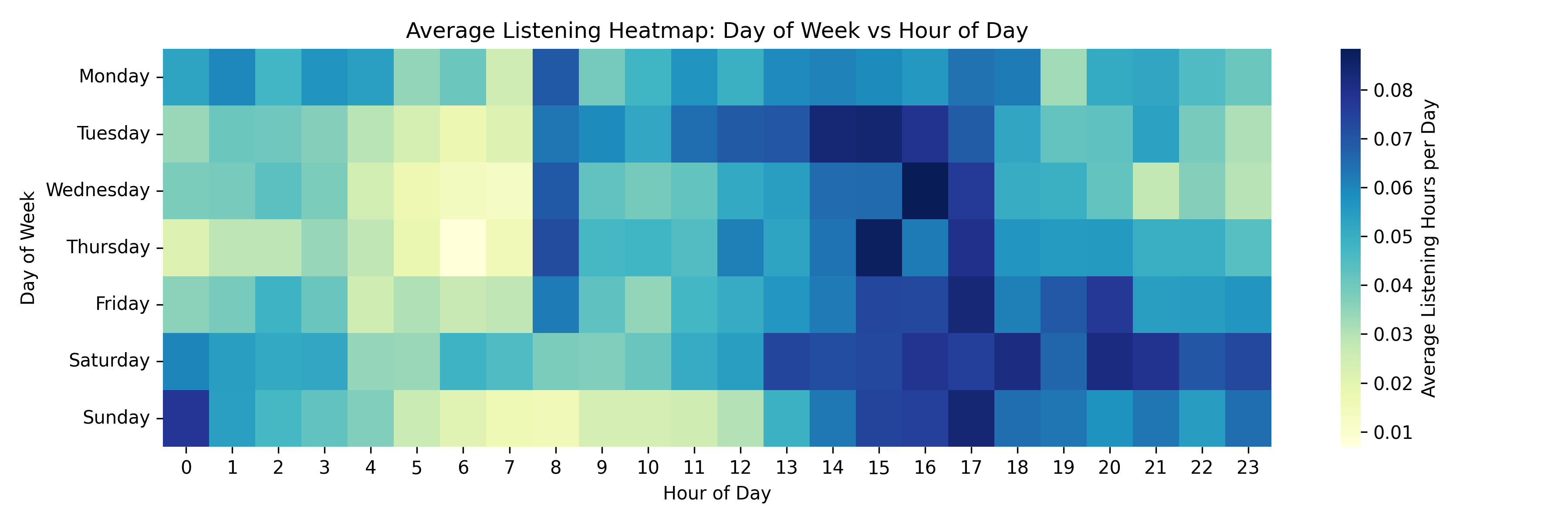
Several patterns jump out to me:
• I tend to play music the most on Wednesday-Saturday afternoons and evenings, around 2:00 p.m. to 5:00 p.m. Work or school is coming to a close, and I’m shifting mental gears around this time. I remember during my internship, I would use music to help me stay “in the zone,” so I didn’t lose momentum as everyone else was getting ready to leave.
• Early mornings (around 5:00 a.m. to 7:00 a.m.) are almost silent. I only listen to music when I’m resetting the house before my morning coffee and book, where I prefer complete silence.
• There’s a consistent listening period from Saturday at 1:00 PM until it hits 1:00 AM on Sunday. After that, the amount of listening tends to die down. You can see a consistent routine here. Looking back, I would probably use my free time to catch up on work or play games- both of those activities often involve music in the background. It’s fun to see what times I call it quits for the night.
Click here to reveal the code snippet
# Extract weekday (0=Monday) and hour of day
df['weekday_num'] = df['timestamp'].dt.dayofweek
df['hour'] = df['timestamp'].dt.hour

# Days present for each weekday
weekday_day_counts = df.groupby('weekday_num')['date'].nunique()

# Total hours for each (weekday, hour)
heat = (
    df.groupby(['weekday_num', 'hour'])['hours_played']
      .sum()
      .reset_index()
)

# Vectorized: divide by days for that weekday
heat['avg_hours'] = heat['hours_played'] / heat['weekday_num'].map(weekday_day_counts)

# Pivot to matrix
pivot = heat.pivot(index='weekday_num', columns='hour', values='avg_hours')

# Labels
week_labels = ['Monday','Tuesday','Wednesday','Thursday','Friday','Saturday','Sunday']
pivot.index = week_labels

# Plot
import matplotlib.pyplot as plt
import seaborn as sns

plt.figure(figsize=(12, 4))
sns.heatmap(
    pivot,
    cmap='YlGnBu',
    cbar_kws={'label': 'Average Listening Hours per Day'},
)
plt.title('Average Listening Heatmap: Day of Week vs Hour of Day')
plt.xlabel('Hour of Day')
plt.ylabel('Day of Week')
plt.tight_layout()
plt.show()
Let’s do some forecasting
I attempted to forecast how many hours I’d listen in the weeks following the start of January 2025. Since daily data is pretty noisy, I aggregated it into weekly totals and used the pmdarima library, selecting an appropriate ARIMA model.
The plot focuses on the period from January 2023 onwards to give a clearer picture of recent listening patterns. The orange band shows the 95% confidence interval for the forecast.
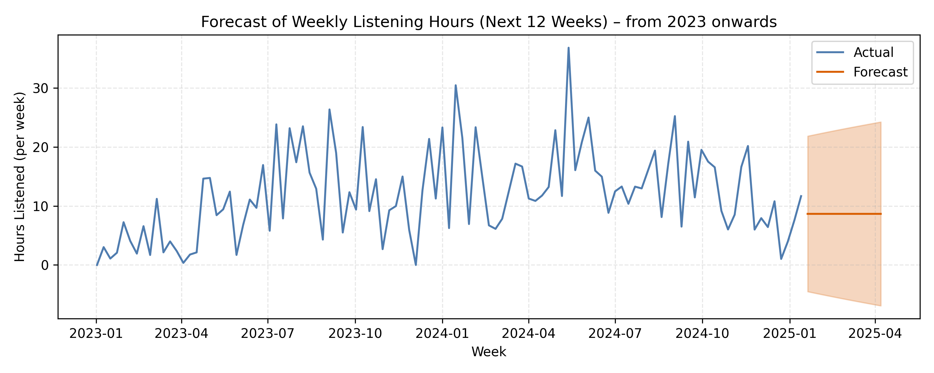
The model suggests I’ll likely listen to around 8-20 hours per week in early 2025, with a wide uncertainty band. That makes a lot of sense, since my weekly listening has oscillated between 5 and 35 hours in the past two years. Forecasting is inherently uncertain, since there are so many external factors that can and will affect how much I listen to music. Factors would include: a new favourite artist, a sudden life change, whether it’s physical or emotional. Either way, it’s fun to see what the data predicts.
My evolution in taste
Here, I aggregated the listening hours by month and genre. I plotted this information using a stacked area chart displaying trends for my top five most popular genres.
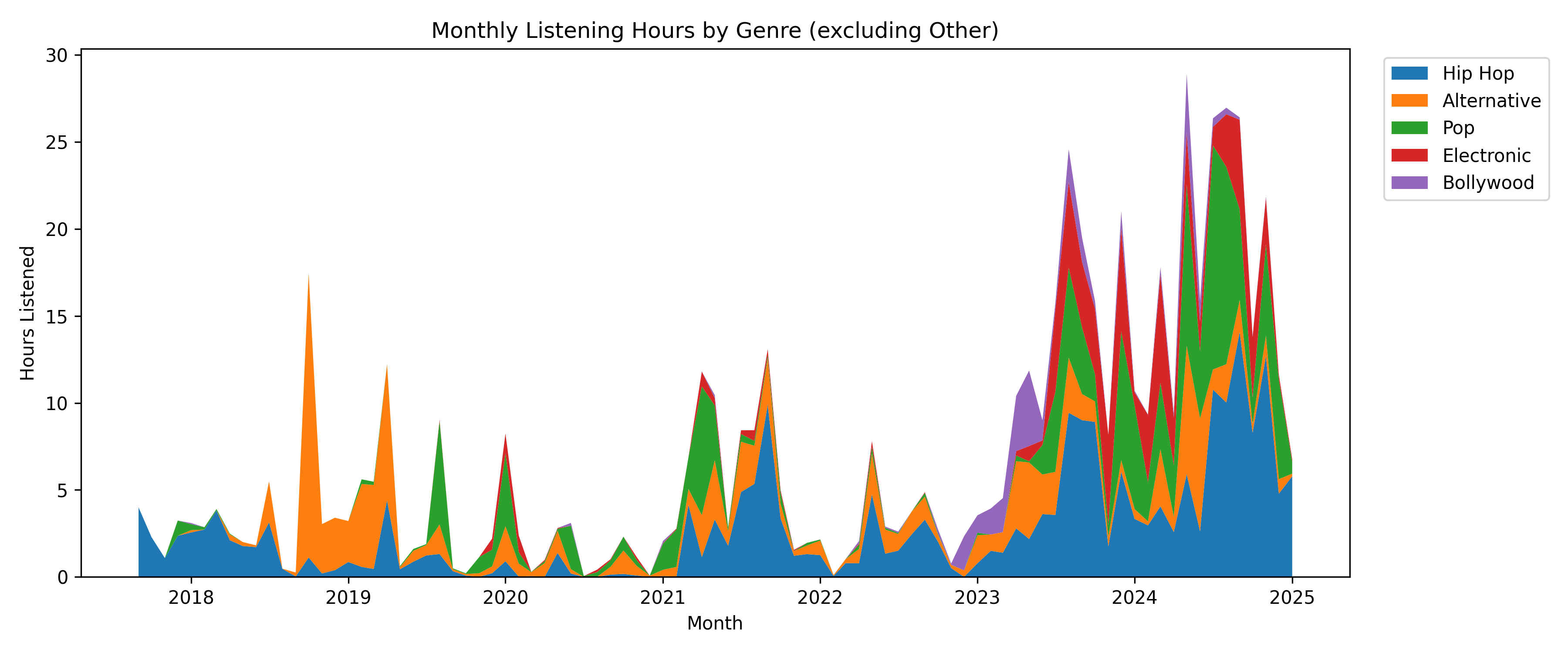
I would have been 15, turning 16 years old during 2018. During this time, I had a reasonably low listening time, dominated by hip hop, with some pop peeking through. Around 2019 was when I started dipping my toes into alternative music some more. It wasn’t until I entered university post-COVID, when you can see my taste absolutely explode with so many different genres at the same time, each fighting for the top spot. I also find it super fun seeing the occasional Bollywood binge poke through.
Discovery vs comfort listening
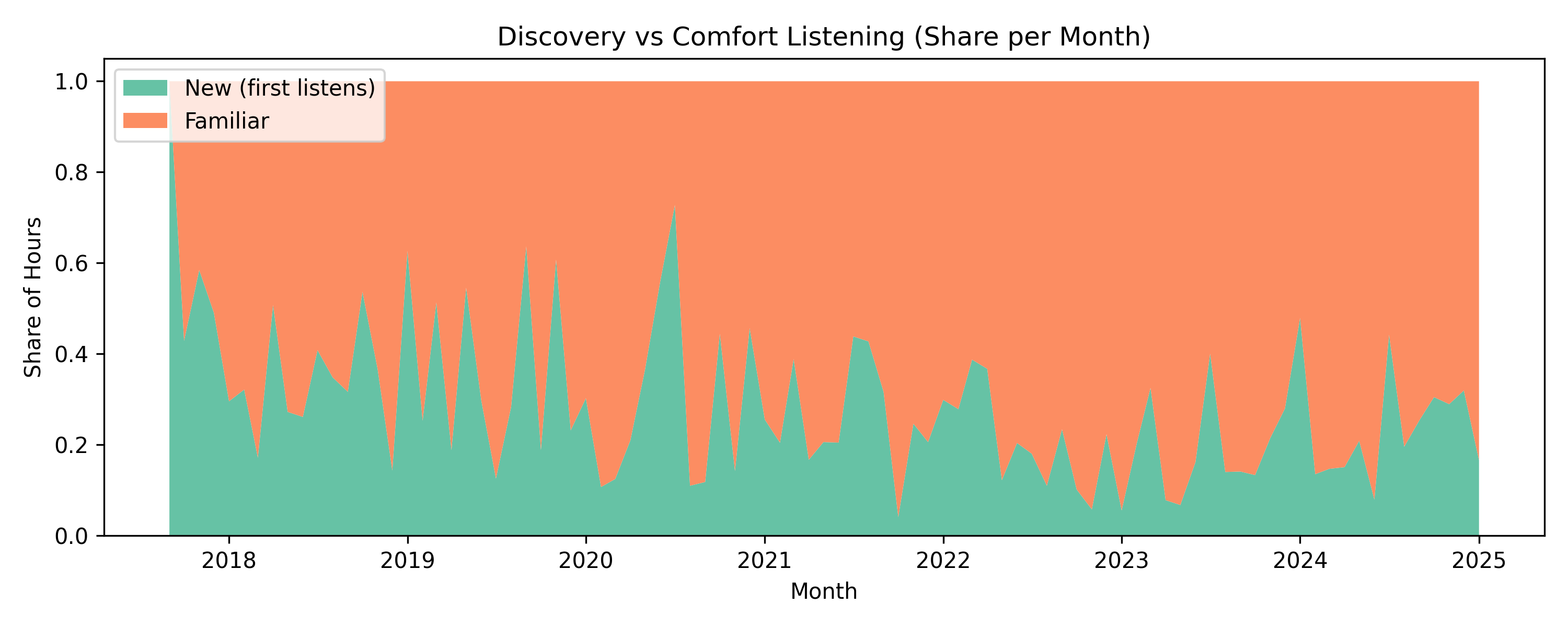
Alongside my evolution in taste, we can take a look at the monthly share of hours spent on new versus familiar music with this 100% stacked area chart. Here, we can see new music spikes around the release of anticipated albums or during phases of exploration. Those peaks begin to wane as those new tracks fall into my daily rotation until I get in the mood for new music again. What we see is pretty interesting- my curiosity seems cyclical: periods of discovery are followed by long spells of comfort listening.
Let’s get picky
I skip songs like there’s no tomorrow sometimes. I am actually very excited about this investigation, since I’ve been incredibly curious if I can find some trends here. By aggregating the boolean skipped flag by day of week and hour, I computed a skip rate. This heatmap shows me some awesome information that I was hoping to see. My skip rates peak during mid-morning and early afternoon on weekdays. Here, I can see that I’m much more selective about what’s playing during these times. Late evening sessions have low skip rates, suggesting I’m more settled into a playlist or album.
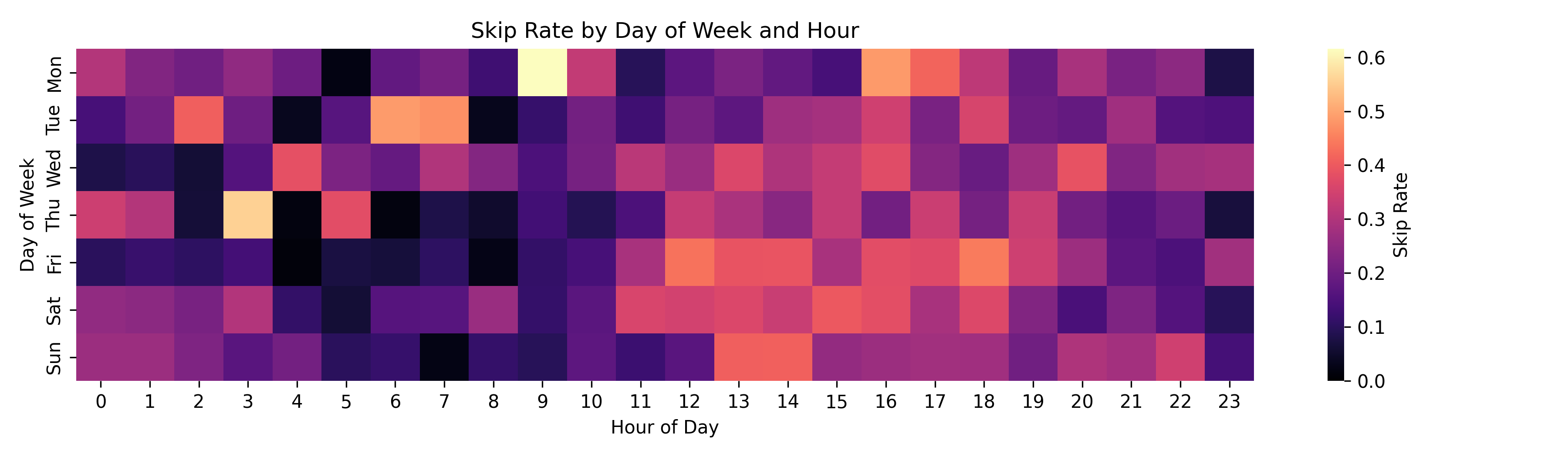
This is probably my favourite graph that I have put together because I’ve learned something new about myself here. I’ve recently been on a journey to cut down on the amount of decisions that I make during the day. I can see myself get more more choosy during parts of the day where I might be trying to find my aforementioned “zone”. Using this newfound information, it looks like I need to work on making more playlists that keep me in that focused state. Honestly, this data is so exciting to me because it provides a clear path to turn this knowledge into actionable steps.
Closing thoughts
Sifting through my own Spotify history has been super nostalgic and surprisingly insightful. Simple aggregations revealed listening trends that I didn’t know existed, like 12:00 a.m. on a Sunday being when I consistently jam out before calling it a night. It’s fun taking a look at the data points and trying to remember what was going on in my life during that time. A pleasant surprise was discovering habits that I can act on. My original idea for this post was to take a dive into a huge dataset while also having a retrospective on life. I noticed my musical tastes shifted alongside pivotal moments in my life. Of course, those major moments in my life aren’t displayed here, but echoes of them are hidden in the shifts, peaks, and quiet valleys of my listening history.